Marketplace main image
An Amazon, Etsy or Google Shopping listing needs the product alone on pure white, filling the frame, no props.
A compliant main image from the sample photo you already have.
AI Product Photo Generator
Turn any product image into a professional e-commerce packshot — 30+ backgrounds, ghost mannequin, flat lay, and bulk mode for 25 products. Free to start.
Upload one ordinary photo of your product. Get the white packshot your marketplace requires, the lifestyle frames that actually sell it, and a short motion clip — from the same image, in under a minute.
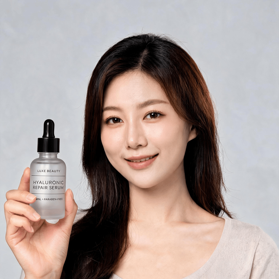
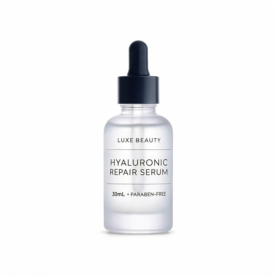
One product image in. Drag to compare.
An AI product photo generator takes one ordinary photograph of a real product and re-renders it as professional e-commerce photography — relighting it, replacing the background, and presenting it as a white packshot, a flat lay, a held shot or a styled lifestyle image. The product itself is preserved from your upload; only the photography around it changes.
It is not a text-to-image tool. Pixla works from a photograph of the physical item, which is what keeps label text, colour and proportions faithful to what a customer actually receives — and it means you still need the sample in hand.
Most product-photography advice pretends every item behaves the same. It doesn't — the differences are almost entirely about how surfaces handle light. Pick a category and the lighting model changes with it.
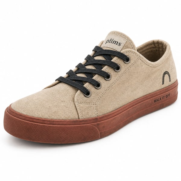
Flat-lay garments become on-model or ghost-mannequin shots that keep the weave, the seam lines and the true colour of the fabric.
Pure white is a compliance requirement, not a style — it's the price of entry for marketplace image one. Everything after it is where the buying decision actually happens.

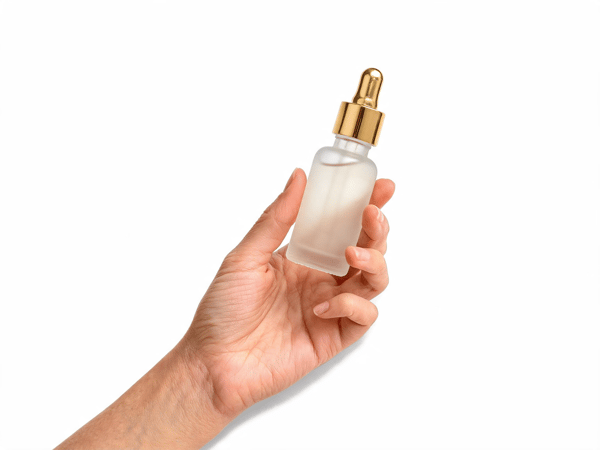
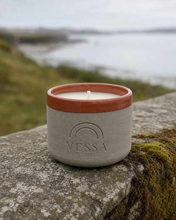
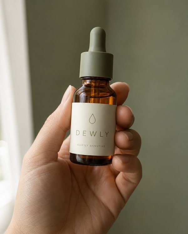
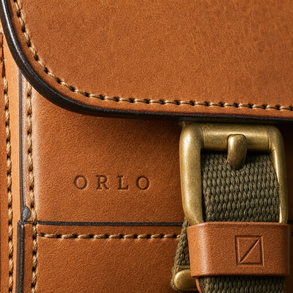

Six jobs that come up constantly, each shown as the output rather than described. Every image below was generated from a single photograph of a real product.
Featured use case
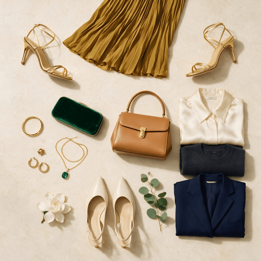
Apparel sells on drape and fit, and a flat lay shows neither. The same pieces — skirt, shirt, bag, shoes — go in laid out on a table and come back worn, lit and styled, with the fabric behaving the way it does on a body.
It is the cheapest way to add the frame most apparel listings are missing, and it needs no model booking, no studio and no reshoot when the colourway changes.
Try it with your flat lay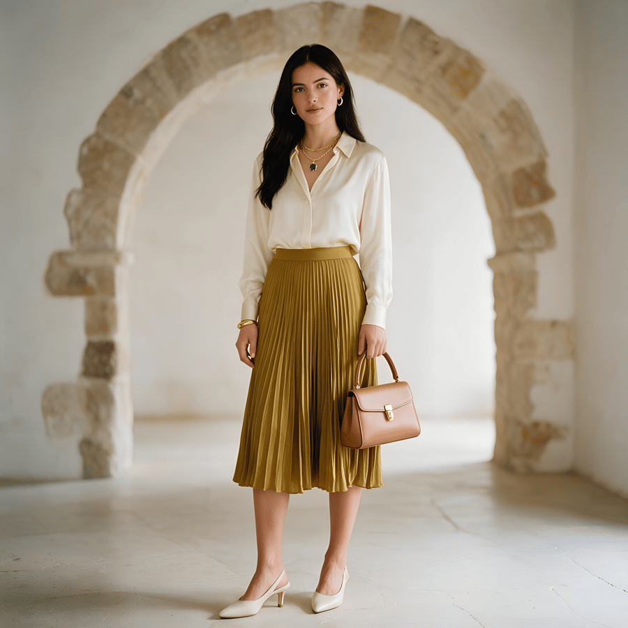
An Amazon, Etsy or Google Shopping listing needs the product alone on pure white, filling the frame, no props.
A compliant main image from the sample photo you already have.

A Meta or TikTok campaign needs a creative that reads at thumb speed and still shows the product honestly.
Feed-native framing with room for the headline, in the campaign palette.
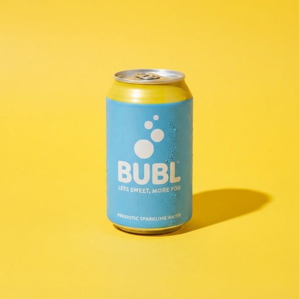
A seasonal push needs the same SKU on a bold background that matches the campaign, not the catalogue.
One product, any backdrop — without booking the set twice.

A new SKU drops before the product photography does, and the launch post still has to go out.
Announcement graphics ready the day the sample lands.

The listing needs the creator-style frame buyers trust, without booking a creator for every SKU.
A held, in-context shot that shows scale and everyday use.
Packaging changed, or the store is being rebranded, and every listing image is now slightly wrong.
Re-run the catalogue against one preset instead of rebooking a shoot.
Listings with video hold attention longer, and paid social placements are built for motion first — a still frame in a video slot is competing at a disadvantage before anyone reads the caption.
A clip generated from the same upload keeps the product identical between your photograph and your video. A listing where the still and the clip disagree about colour is worse than one with no clip at all.
A phone photo is enough. Shoot the product against any background, in any light — the input only needs to show the product clearly and in focus.
Choose the product category so lighting and reflection handling match, then pick the background — white for marketplaces, styled for ads and social.
Export at listing resolution. Bulk mode applies the same look to up to 25 products at once, which is what keeps a catalogue visually consistent.
Worth being straight about. Generation wins on cost, turnaround and consistency at volume. A photographer still wins on art direction.
| Consideration | Studio shoot | Pixla AI |
|---|---|---|
Cost for 25 products A day rate plus stylist and retouching, against a credit per image | ||
Turnaround Booking to delivery is typically days; generation is under a minute | ||
Reshoot after a packaging change A studio reshoot is a new booking; here it is a new upload | ||
Physical sample required You still need one photo of the real product — nothing is invented | ||
Consistent look across a catalogue Human shoots drift between sessions; a preset does not | ||
Genuinely novel art direction A photographer will still out-think a preset on a hero campaign |
What the photograph has to achieve, how it changes by category, and where generation genuinely helps.
A product photograph has one job that matters more than any other: it has to make a stranger confident enough to spend money on something they cannot touch. Everything else — the styling, the background, the crop — exists to serve that. This is why the technically perfect shot sometimes converts worse than a slightly plainer one. The buyer is not judging your photography. They are trying to work out what will arrive in the box.
That reframes what "good" means. A photograph that flatters the product but misrepresents its colour will earn a return and a bad review. One that shows the product honestly, at a size the buyer can judge, on a background that does not compete with it, will outperform a more beautiful image that leaves a question unanswered. The most common failure in e-commerce photography is not ugliness. It is ambiguity.
The plain white packshot is not a stylistic choice; it is a compliance requirement. Amazon states the main image must "have a pure white background (RGB color values: 255, 255, 255)", and Google Shopping applies comparable rules. Getting this right is the price of entry, and it is unglamorous work: even lighting, clean edges, no shadow pooling at the base, product filling most of the frame without touching the edges.
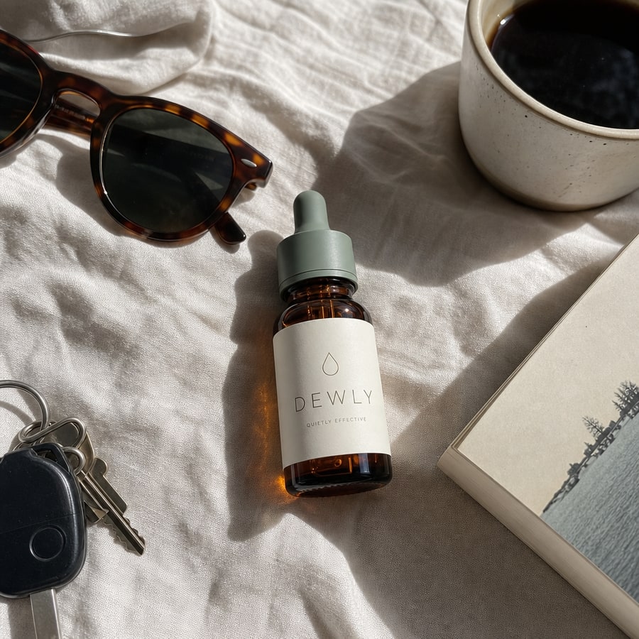
But a catalogue made entirely of white packshots tells the buyer nothing about the product in use. This is where the second and third images earn their place. A held shot answers scale instantly — a bottle in a hand needs no dimensions table. A styled surface shot places the product in the life the buyer imagines. A macro crop proves the finish is what the description claims. Sellers who treat image two onward as an afterthought are leaving the most persuasive frames empty.
The practical sequence most sellers converge on is the same: white packshot first for compliance and for the grid, then scale, then texture, then context. You can argue about the order of the last three. You cannot skip the first.
Sources: Amazon Seller Central — Product image guide — main image must be on pure white, RGB 255, 255, 255 · Google Merchant Center — Image requirements
Product photography advice is usually given as though all products behave the same way. They do not, and the differences are mostly about how surfaces handle light.
Clothing is a geometry problem. Fabric drapes, folds and stretches, and the failure mode is a pattern that changes scale across a fold or a seam that dissolves. What you are protecting is the weave and the true colour, because those are what a returns request is written about.
Electronics is a reflection problem. Brushed metal, glass and gloss plastic each throw light differently, and the tell of a bad render is highlights that do not agree with each other — as though the object were lit by three suns. Screens are their own trap: clip them to white and the product looks switched off.
Beauty is a typography problem more than anything else. Buyers read labels. An image that softens the text on a serum bottle into approximate letterforms has failed, however attractive the lighting. Glass translucency matters for the same reason — it is how a buyer judges how much product is in the bottle.
Food and beverage is a context problem. The packaging is usually simple; what sells is the surface it sits on and the temperature the image implies. Condensation on a cold can does more work than another degree of sharpness.
The honest case for generating product photography is consistency and cost at volume, not artistry. A preset applied across twenty-five products produces a grid that looks deliberate, because every frame shares the same lighting, crop and background. Human shoots drift between sessions — different day, different assistant, slightly different light — and that drift is visible in a catalogue grid even when each individual image is excellent.
The cost argument is straightforward. A studio day with a stylist and retouching is a real budget line, and it has to be repeated every time packaging changes or a variant is added. Regenerating from a new photo does not carry that cost, which changes what is worth photographing at all. Long-tail SKUs that never justified a shoot can now have proper images.
What AI does not replace is art direction. A hero campaign image — the one with an idea in it — still comes from a person who understands the brand. A generator will reliably produce a good photograph of your product; it will not decide that your product should be photographed underwater because that is the story this season. Treating it as a replacement for that judgement produces catalogues that are technically clean and completely forgettable.
There is also a hard limit worth stating plainly: the tool works from a photograph of a real product, not from a description. That constraint is deliberate. It is what keeps the output honest about colour, proportion and label text — and it means you still need the sample in your hand.
Static product images are no longer the whole job. Amazon now recommends at least six additional images and one video per listing, and paid social placements are built for motion first — a still frame in a video slot is competing at a disadvantage before anyone reads the caption. The marketplaces have moved faster than most catalogues have adapted.
The barrier has been production. A short product clip traditionally meant a second shoot, a turntable or a gimbal, and an edit — a different budget and a different vendor from the stills. Generating motion from the same product image collapses that into one step, and more importantly keeps the product identical between your still and your video. A listing where the photograph and the clip disagree about colour is worse than a listing with no clip.
The useful moves are unglamorous: a slow orbit that shows the product in the round, a push-in that lands on the detail the description is about, a lift that shows weight and scale. None of them are cinematically ambitious. All of them answer a question the still could not.
Source: Amazon Seller Central — Product image guide — recommends six additional images plus one video per product
The difference between a catalogue that looks professional and one that looks assembled is almost entirely process. Photograph every product the same way on input — same distance, same orientation, same rough lighting — and the generated output will be consistent without further effort. Vary the input and no preset will save you.
Decide the preset before you start, not per product. The temptation is to pick the nicest background for each item, which produces a grid that reads as a marketplace of different sellers. Pick one surface for the main image across the whole catalogue and vary only in the secondary frames.
Then run in batches and review as a grid, not one at a time. Problems that are invisible in a single image — a drift in background tone, an inconsistent crop, one product photographed noticeably larger than its neighbours — are obvious the moment you see twenty-five thumbnails together. That review step takes minutes and is the one most often skipped.
25 credits on signup, no card. Enough to photograph several products and judge the output against your own listings before spending anything.
Start with one photoMore ways to create with Pixla AI